I started by looking at the Fathom and to try to answer the following:
Refine question
Which age group has the most accidents?
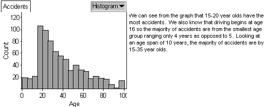
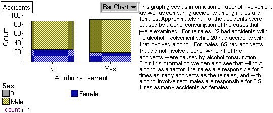
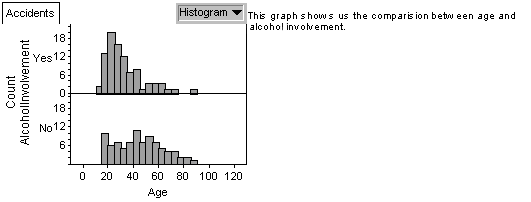
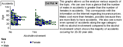
Using Fathom I created four different graphs and
gave a description as to what
it represented.


Also using Fathom I was able to calculate the measures
of central tendency and spread.

There were serious limitations concerning
the Fathom data itself. I preferred
the Ministry of Transportation data because it was Canadian and compares
accidents to age and the age distribution of drivers. Although I did
quite a bit
of analysis with the Fathom data, it was only after I located the
MTO data
website http://www.mto.gov.on.ca/english,
and its Ontario Road Safety
Annual Report 2000 that I made substantial progress.

Problem
With this data, exploration will take place concerning
drivers involved in
collisions and drivers killed with both put into
perspective concerning the
amount of drivers licensed per age group.
This should allow me to draw
useful conclusions concerning the distribution
of insurance rates.
Plan
To gather data from the MTO website, access the
internet address
http://www.mto.gov.on.ca/english/ and press "search".
Search the MTO for
the "Ontario Road Safety Annual Report 2000".
Access or download the full
report, not chapters, in .pdf format.
The .pdf file can be found at the internet
address http://www.mto.gov.on.ca/english/safety/orsar/orsar00/ors_00.pdf.
The data to be used is found on table 2.2 "Category of Person
Killed by Age
Groups 2000" and table 2.20 "Driver Age Groups
- Number Licensed, Collision
Involvement and Per Cent Involved in
Collisions 2000". I think the limitations of
the data are insignificant,
e.g. unlicensed drivers are taken into consideration
for "Drivers
Involved in Collisions" but not added to the "Driver's Licensed"
used to calculate the "% of Drivers of Each Age Involved in Collisions".
Data
The data obtained from the MTO is as follows
as entered into Fathom Collection
Charts:


I have revised the charts to include
the age group 16-24 and the data has been
restricted to include only
the data I want to explore.
In Fathom the following dot plots were made
to graphically represent the data in table 2.2 and table 2.20:
Graph 1: Population of Licensed Drivers by
Age Group

Graph 2: Population of Drivers
Involved in Collisions by Age Group

Graph 3: The percentage of Drivers
Involved in Collisions by Age Group

Graph 4: The amount of Drivers Killed
in an Accident by Age Group

Graph 5: The Percentage of Drivers Killed
(considering Drivers Licensed) in an
Accident by Age Group


Analysis
Graph 1 shows a bell-shaped curve of licensed drivers by age group
with the
most licensed drivers being in the 35-44 year old range.
Graph 2 shows that
the age group involved in most collisions is the
35-44 year olds. Graph 3
shows a
regression in values and that the highest percentage of drivers
involved in collisions when the amount of licensed drivers is taken
into
consideration is the 16-24 year olds. This reveals that even
though there are
more 35-44 year
olds involved in accidents than 16-24, it can be explained by
the
greater amount
of 35-44 year old licensed drivers. Graph 4 shows a
regression in
deaths as
age increases but when graph 5 is taken into
consideration there is
not really a difference in the amount of deaths between
age groups.
Conclusion
The data represented in graph 3 reveals that
the percentage of drivers involved
in a collision decreases as age increases. However, our data does
not take into
account the amount of driving done by age group or how often they
are on the
road. This data could support a decrease in insurance rates as age
increases
so in the next section I will explore insurance costs and further
explore the data
in graph 3.
>>NEXT