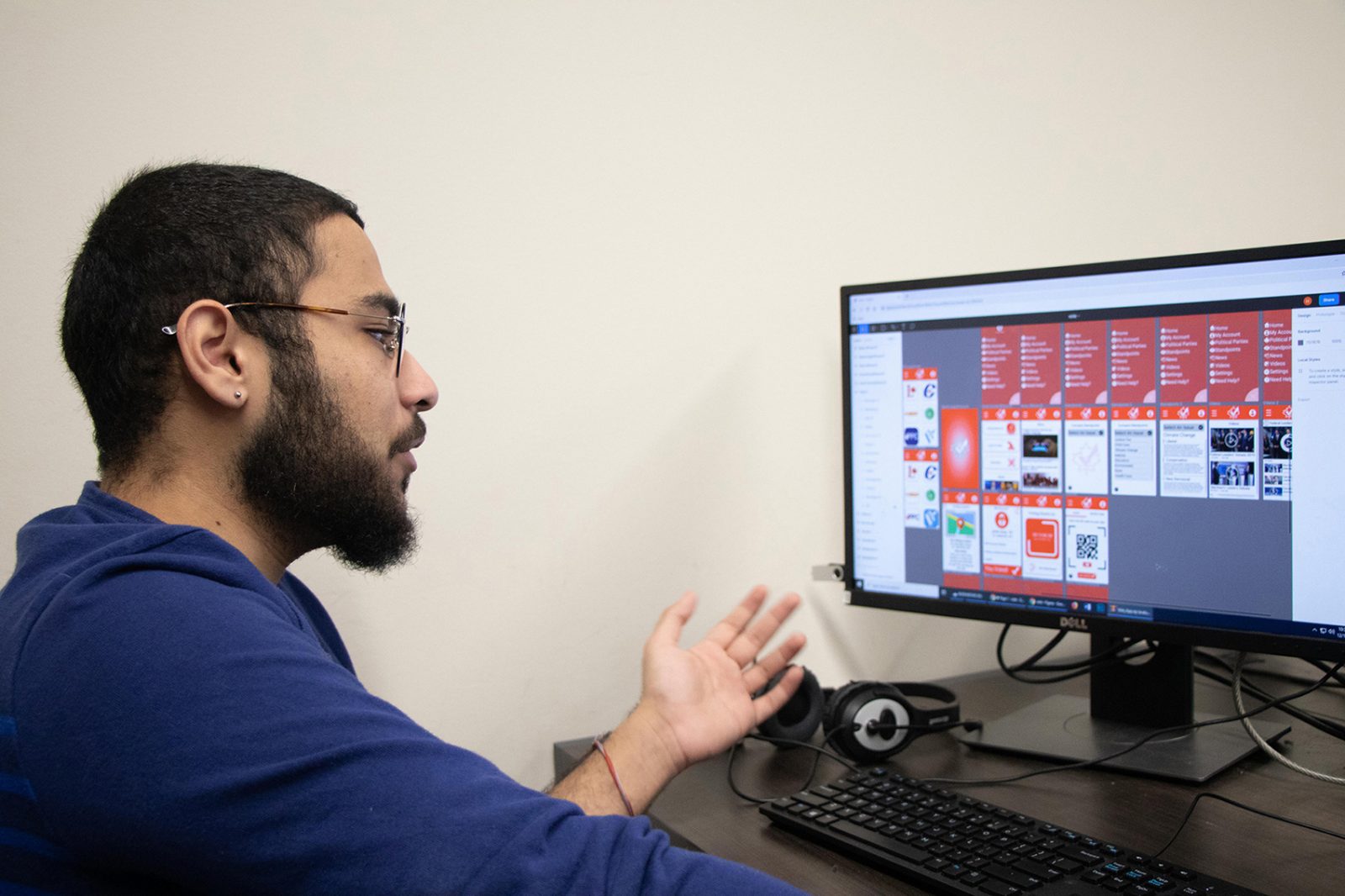
 Second-year Interactive Arts and Science student Hashim Kahn shows the design process behind his group’s voting app prototype. Students in IASC2P03 use industry standards and empathetic design to tackle big social issues.
 What do microplastics, voting, shopping delivery and mental health have in common? They’re all important issues students are tackling with tech.
Students in the Interactive Arts and Science class on User Interface Design spent last semester using empathy-driven design processes to tackle current issues including microplastics in the environment, voter apathy, and health and wellness.
“This is a design process that places people at the heart of our practice,” says Aaron Mauro, Assistant Professor with the Centre for Digital Humanities. “Once we understand the human dimension of a problem, we are then ready to take up an entrepreneurial approach that develops software to match our goals.”
For students Katrina Lenselink, Tess Smith-Laskowski and Ashlyn Kells, the problem they took on was microplastics in tea.
“Ashlyn had seen advertisements about the dangers of microplastics in tea and it concerned her because she is an avid tea drinker,” said team leader Katrina Lenselink. “We extended the idea to include other environmental issues.”
A study released by University of Montréal researchers last fall showed that a single-use plastic tea bag could release up to 11.6 billion microplastic and 3.1 billion smaller nanoplastic particles into the hot water.
The students’ app design, What’s the Tea, Sis?, encourages users to think about the environmental impact of where their tea comes from and how it’s consumed, as well as allowing consumers to make informed decisions about tea brands. The design included the ability to rate restaurants on their plastic use, discussion boards, and tips and information about reducing plastic waste.
Inspired by the fall election, students Ethan Bowbyes, Hashim Khan and Devin Dempsey wanted to design an app that could communicate complicated political platforms in a way that allowed younger people to educate themselves on important issues.
“There are so many people who don’t go out to vote because they don’t want to stand in line,” says Khan.
The group also had to consider bias in their design and make decisions about what information they included and even what colours they used in their design.
“We decided we wanted to put in information about political parties,” says Kahn. “But which party comes first? Who decides that? What order do they appear in?”
Over the course of the past semester, learned industry workflows and standards for user interface (UI) and user experience (UX) to develop their apps.
While these won’t be in the app store any time soon, the design exercise is important to students.
“Creating this app helped us to understand UX and UI because you have to focus on all aspects of a user interface that you might not notice as a user,” says Lenselink.
“We were able to see the different stages that designing an app goes through, such as the in initial idea stage, wireframes, prototoyping and HTML. There’s a lot more that goes into than we originally thought.”


